
Estimated reading time: 5 minutes
You shouldnʼt judge a book by its cover. But let’s face it – we all do! Though podcasts are mainly an audio experience, cover art is very important. Similar to a book, your podcast’s cover art can be the key difference between someone scrolling past or clicking listen now.
You must submit your podcast’s cover art to the major podcast platforms when you upload your show. So, even if your audio quality is up to a high standard, you won’t get very far without some decent cover art and a logo.
Here are my top tips for creating some sublime podcast cover art:
1. Subject matter, matters
You may have some wild and wonderful ideas for your cover art, but remember that you need to consider what your design is trying to portray.
Your final cover art should reflect your show’s:
- theme
- tone of voice
- genre
- audience
Does your podcast focus on a particular topic? Does it feature a celebrity guest? These are all the sorts of things you need to think about, as they shall become the key ingredients for your cover art.
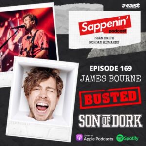
Sappenin’ is a great example – their main sell is their exciting guest appearances, so this is shown front and centre on their cover art.
2. What is your demographic?
The next step is taking some time to define who your podcast’s target audience is. Think about what sort of imagery would appeal to them and what would draw them in.
Some factors to consider are:
- age
- gender
- location
- interests
- why will your audience care about your show – what are you selling them?
TOP TIP: Don’t try and appeal to everyone. Casting your net too wide will just make things more difficult. Narrowing down your listenership and targeting their taste will be a rewarding accomplishment.
Always think about your audience when making key decisions about your cover art, such as fonts and colour. Bright colours may appeal more to a younger audience, for example, whereas a more formal style may appeal more to business professionals.
The Sound Heap cover art is a great example, which really appeals to a certain demographic. The large mouth makes a big statement, and suggests that the podcast has a lot to say. The contrasting colours also make it stand out. You can tell that Sound Heap doesn’t take itself too seriously, which would appeal to comedy fans and potentially a younger (or young at heart!) audience.
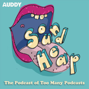
There’s another interesting thing about Sound Heap though. You see, this comedy podcast revolves around a fictional podcast network (called Sound Heap) which makes spoof shows and satirical sketches. If you look at Sound Heap‘s Twitter, you can see all of the cover art and graphics they’ve made for each of their fictional podcasts. Each one is bold and daring, using fonts that relate to the theme of each sketch.
3. Consider the colour wheel
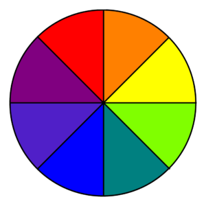
Colours right next to each other on the colour wheel are usually good to pair together. These colours are typically used if you are creating something more uniform, such as a business or factual podcast.
Complementary colours are across from each other on the colour wheel (like blue and orange). They contrast each other and are therefore very eye-popping. Podcasts with a vibrant subject matter, or a younger demographic, might choose a contrasting colour pallet.
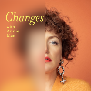
Annie’s Mac’s podcast, Changes, uses colour effectively to draw the eye in. The yellow font really catches your gaze.
4. Typography and tone of voice
If the colour is what grabs people’s attention, then the font is what keeps them interested.
Font usually portrays the theme of your podcast. If your show is a lighthearted chat, you will usually use a more creative, fun font like a Sans Serif or Script (like Baskerville or Futura).
If your podcast has a more serious tone of voice, you may use Serif or Times New Roman fonts (like Arial, Helvetica or Calibri). These are the ones you would normally use in an email template, or to write an essay.
The podcast Hell Bent For Metal uses a creative font that you would normally associate with the metal genre, allowing you to understand the context of the podcast instantly.

5. Use graphic design tools to create your masterpiece
If youʼre on a tight budget, there are plenty of free or affordable tools out there to help you to create your own design. Some of the most popular choices include:
- Canva — the free version of Canva comes with free to use templates for almost every design format, including covers and social media templates. There are loads of free stock photos, video and graphics. They have lots of cover art design templates spanning hundreds of genres to give you inspiration and get designing.
- Adobe Spark — this free tool includes thousands of graphic design templates, stock images and fonts.
- Photoshop — This is worth investing in if you are planning on creating your own social media assets as well as cover art and want to create a more intricate design for your podcast/brand. There are thousands of tutorials online to get you started with Photoshop and you can get a free trial to try it out before you buy.
So there you have it. If you are a budding podcaster, you now know all the top tips for creating your own show-stopping cover art. Time to get cracking!