
Estimated reading time: 5 minutes
Making graphics for your podcast is a very important job. It can seem like a huge responsibility, particularly if you aren’t experienced in graphic design. But don’t worry because I’m about to break down everything you need to know.
What’s the message?
When you’re creating graphics for your podcast, the first thing you need to think about is: how will you catch someone’s eye? How will your podcast stand out among the sea of content already out there?
This can be done by applying one simple rule…
Make sure your graphics are simple, striking and memorable.
You don’t want your viewers feeling confused by your messaging because you’ve created oversaturated graphics with too many icons, too many jazzy fonts, and no clear theme.
As creators, we often try to fit as much information as possible into our podcast art. But this can overwhelm your viewer. Try and be as concise as possible. Thread one specific idea, tone, or style throughout all your graphics, rather than throwing in a tonne of ideas that don’t really work well together.
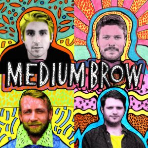
Medium Brow’s cover art is a good example of graphics that stand out, but stick to the theme of the podcast.
Finding a theme
Taking some time to think about the theme of your podcast is essential because this will dictate all of your creative decisions, such as what font, colours and icons to use.
Relay FM are a good example to talk about here because even though the subject matter of each of their podcasts differs, they use the circular motif to tie their branding together. Using relatable icons and colours for each episode allows them to be dynamic yet never lose total track of the theme and purpose of their content. They’ve also made the decision to include their logo on the top right-hand corner. This is a subtle design tip to draw the eye.


Crafting the design
Once you’ve devised a concept, we can move on to the actual design stage.
Firstly, you need to consider the 6 basic elements of design:
- Line
- Shape
- Texture
- Framing
- Colour
- Type
Line
Keep in mind that lines can help to dictate where you want your viewer’s eye to look.
Shape
Similar to lines, you can use different shapes to add focal points to your graphics. Think about whether you want harsh lines, or softer circles. Make sure your design isn’t too abstract so that you start losing your podcast’s messaging, and therefore confuse the viewer.
Texture
When it comes to texture, remember that too much shading and texture will melt the image together on a smaller screen. Keep your designs simple.
Framing
Framing is important. Make sure your icons or photos aren’t too big, or your text isn’t too small. You want everything to be in balance.
Colour
You can use complementary colours in your graphics to make your designs more distinct. If you would like to more about colour choice, check out our blog post ‘5 Things to Consider When Making Your Podcast Cover Art’.
Type
Typography in itself is an art form. But even if you’re a novice designer, it’s doesn’t have to be difficult to find the right font for your podcast graphics. A modern font is cool, a serif font is classic, script is like handwritten. The possibilities are endless. Using a website like dafont really help. The site allows you to find your ideal font using keywords and voila! You can download it and the best part is it’s a free service. After you’ve discovered the perfect font, don’t forget legibility. You cannot make the text too small. If you’re using all caps, then bear in mind the words may dominate and overwhelm the imagery. Alignment is also important when considering type. Make sure your text is positioned correctly, so it’s not too far to one side of the page and the spacing is the same throughout.
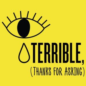
The Terrible Thanks For Asking podcast cover art is a good example where the 6 basic elements of design have all been considered. Take a moment to assess how type, colour, framing, shape etc. has been used wisely.
Creation time
Now that you’ve considered all of these factors, you can start creating. But what software will you be using?
If you have the budget, we would recommend trying out the Adobe suite. Photoshop is a specialist tool for graphic design and you can use Premiere or After Effects to make video.
If you’re on a tight budget, and it’s just key art and social posts you’re wanting to make, there are plenty of free tools online. We would recommend creating a Canva account because they have plenty of templates to choose from. You can use Canva to make cover art, social media posts, website banners, and even create short video clips.
A few final thoughts
You don’t want to spend tonnes of time creating graphics that aren’t actually usable, so make sure that you research the specifications and guidelines your podcast art needs to adhere to.
If you’re uploading your podcast to Apple Podcasts (which you definitely should be doing!) then make sure you follow Apple’s Guidelines which are available here.
The main things you should consider though are:
- Your artwork should be a JPEG or PNG file
- Your file should be 3000 x 3000 pixels
- Make sure your artwork isn’t blurry or pixelated
- Keep things clean – no explicit language
And there you have it! That should be enough to get you started! There’s nothing stopping you from creating beautiful, bold graphics to elevate your podcast – and gain you some listeners along the way!